Project Overview: In 2024, I led the redesign of the product manuals for Sanctuary, a home and office safe brand under SA Consumer Products. The original manuals were dense, overly technical, and visually outdated, filled with black-and-white line drawings, bullet-point overload, and cluttered copy that made even simple tasks hard to follow.
As the brand evolved to focus more on the aesthetic preferences of its design-conscious audience, it became clear that every touchpoint (including the manual) needed to reflect that shift. This project aimed to reimagine the manual not just as a functional document, but as a branded, beautiful, and usable piece that a consumer might actually want to keep.
Goals & My Role
As the sole Graphic Designer on this project, I was responsible for art direction, template creation, layout design, copy editing, and file production. I collaborated with cross-functional teams to understand product features and translated technical specs into clean, consumer-facing content.
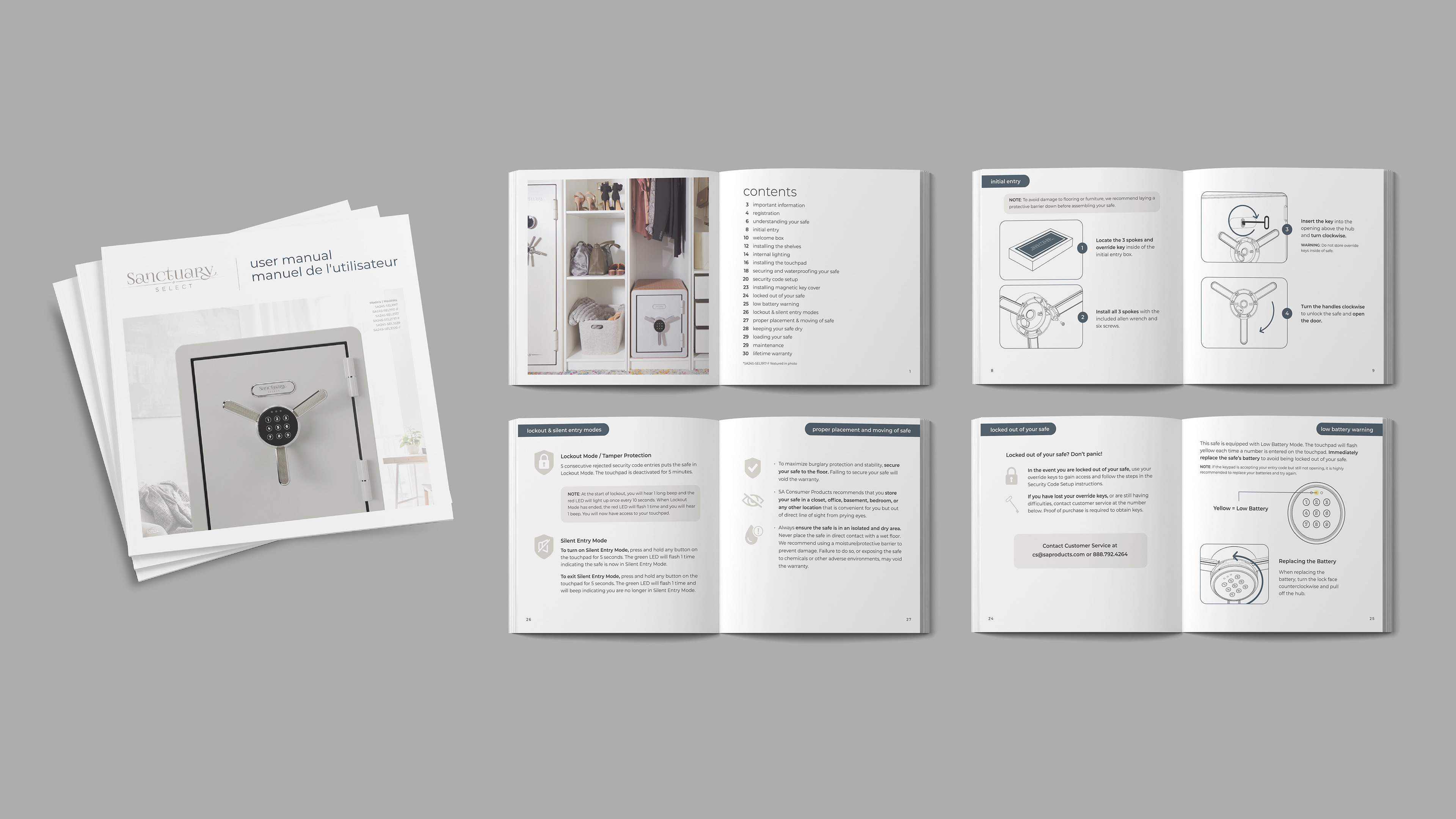
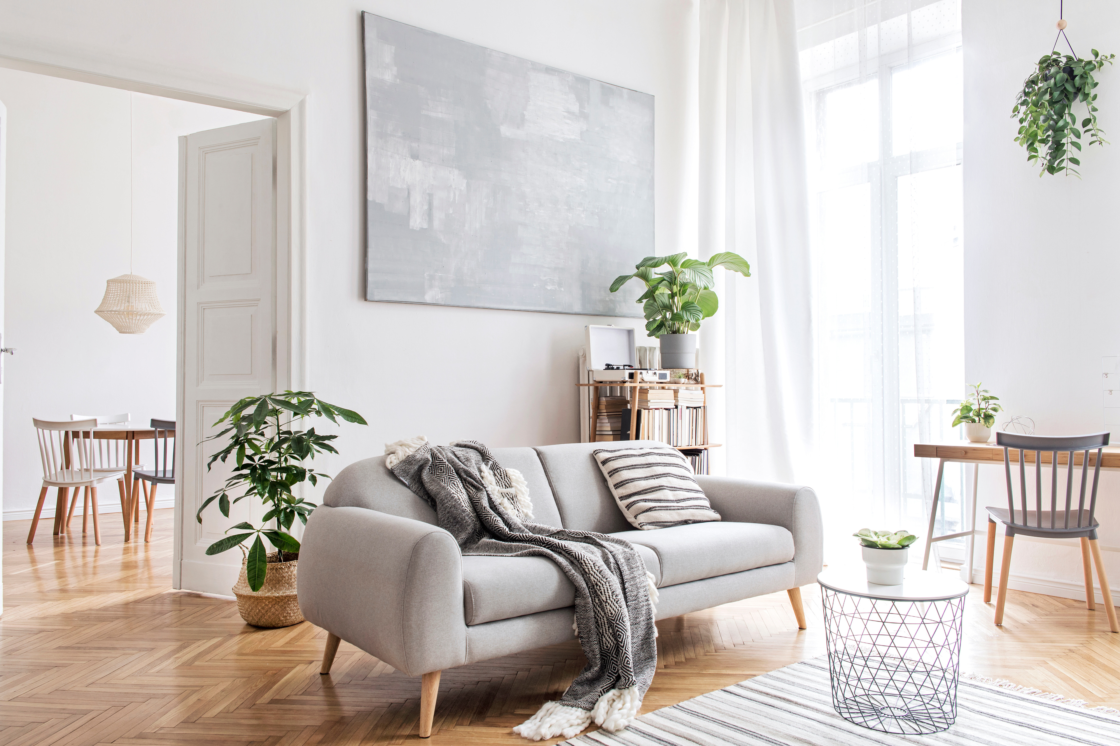
Design for the user: Transform the manual into something worth keeping—more like a lifestyle magazine than a tech manual. I chose to use a square format and magazine-like layouts to relate to our user.Streamline backend creation: Solve internal workflow issues by creating reusable InDesign templates to replace the outdated Illustrator-based process.
Improve clarity: Rewrite technical content to be more user-friendly, approachable, and efficient.
Elevate the brand: Create an editorial-style layout and introduce color, typography, and imagery aligned with Sanctuary’s upscale tone.
To build a manual that felt on-brand and useful, I researched both our consumers’ lifestyle interests (primarily home décor and minimalist design) and competitive manuals across similar industries. Most manuals followed the same utilitarian formula—function over form—and I saw a unique opportunity to turn that on its head.
This editorial approach came directly from what our consumers value: aesthetics, simplicity, and clear communication. I pitched a square format to visually set the manual apart from standard booklets, and used clean grids, modern typography, and ample white space to elevate the experience.
Process: Below are images of the manual that had been in use for years.
Process & Solutions
As the sole Graphic Designer on this project, I was responsible for art direction, template creation, layout design, copy editing, and file production. I collaborated with cross-functional teams to understand product features and translated technical specs into clean, consumer-facing content.
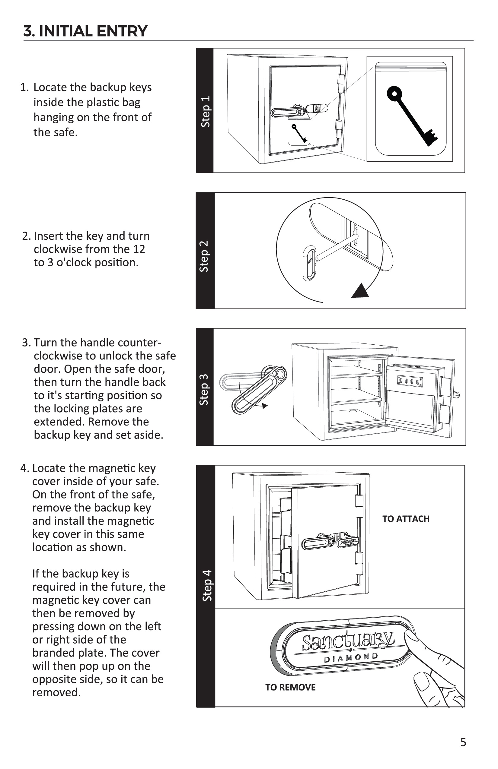
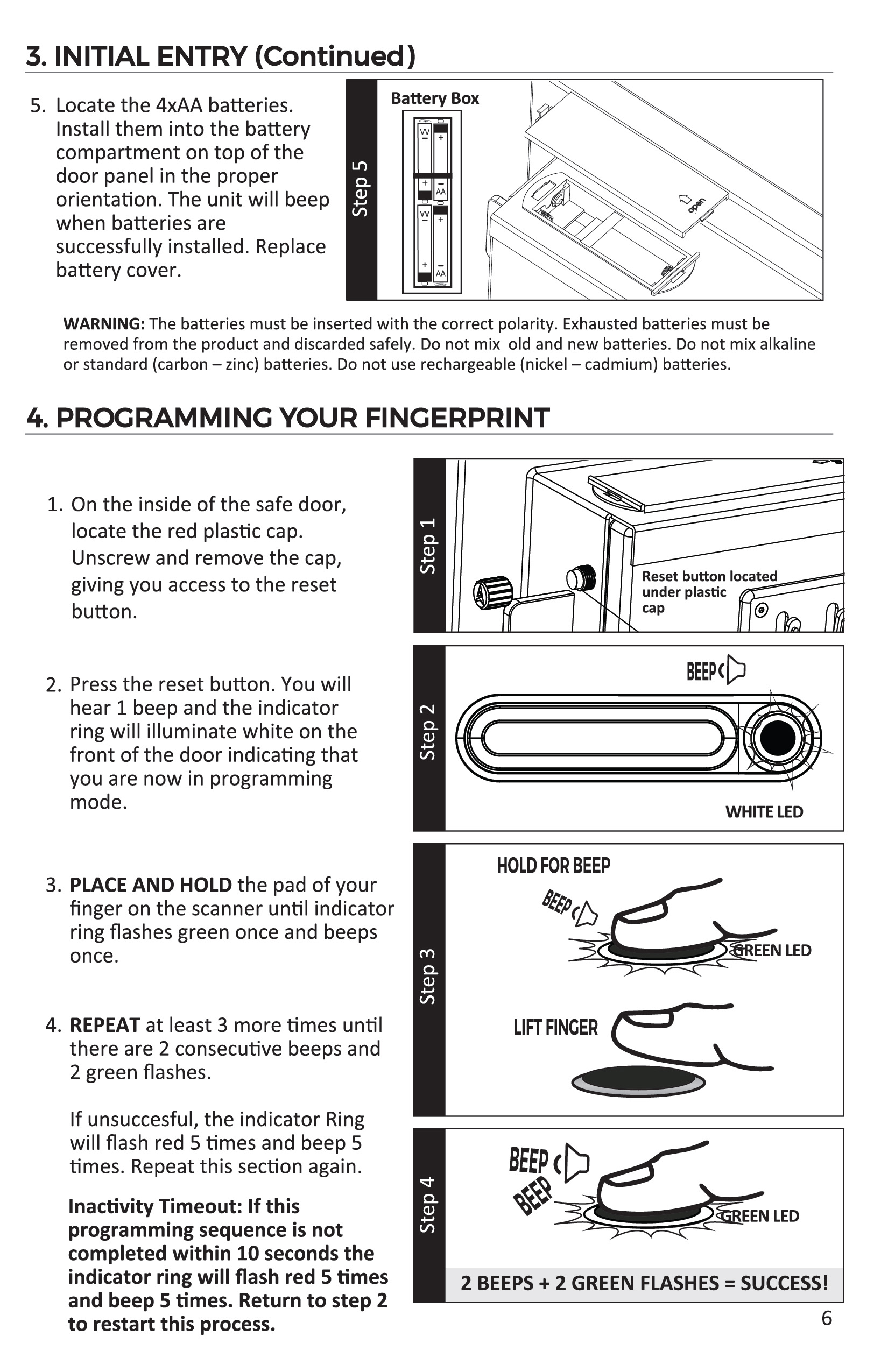
Template Creation: The original manuals were built in Illustrator, which made editing or adapting them time-consuming and error-prone. I rebuilt them in InDesign, creating modular templates that could easily be adapted for various safe types (home, office, fireproof, waterproof, special makeup units). Result: Backend workflow is now faster, more accurate, and easier to maintain for future products.Copywriting & Content Simplification: I rewrote all copy for clarity and efficiency, aiming for a friendly but still instructional tone. Complex directions like “Turn the handle 30 degrees to the left counter clockwise” became simply “Turn the handle counter clockwise.” This tone aligned with our branding while reducing the cognitive load on the reader, which is especially important for a product that might already feel intimidating to set up.
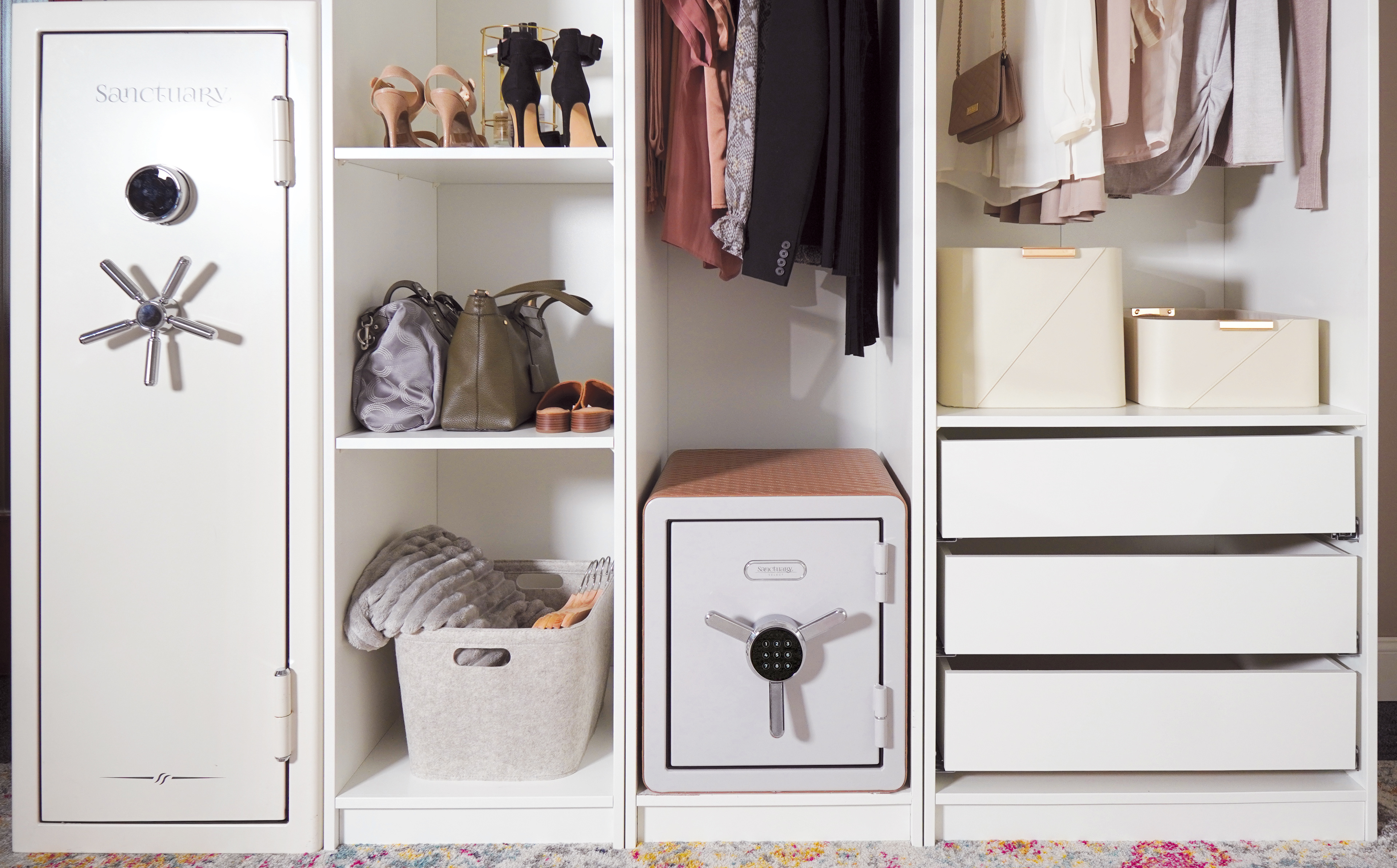
Visual Direction: I art directed a 3D rendering to serve as the hero image of the manual: a styled, modern depiction of the product that feels aspirational, not industrial. This added visual depth and gave the manual a more premium, editorial feel.
Directed brand-styled cover image
Sourced on-brand stock images
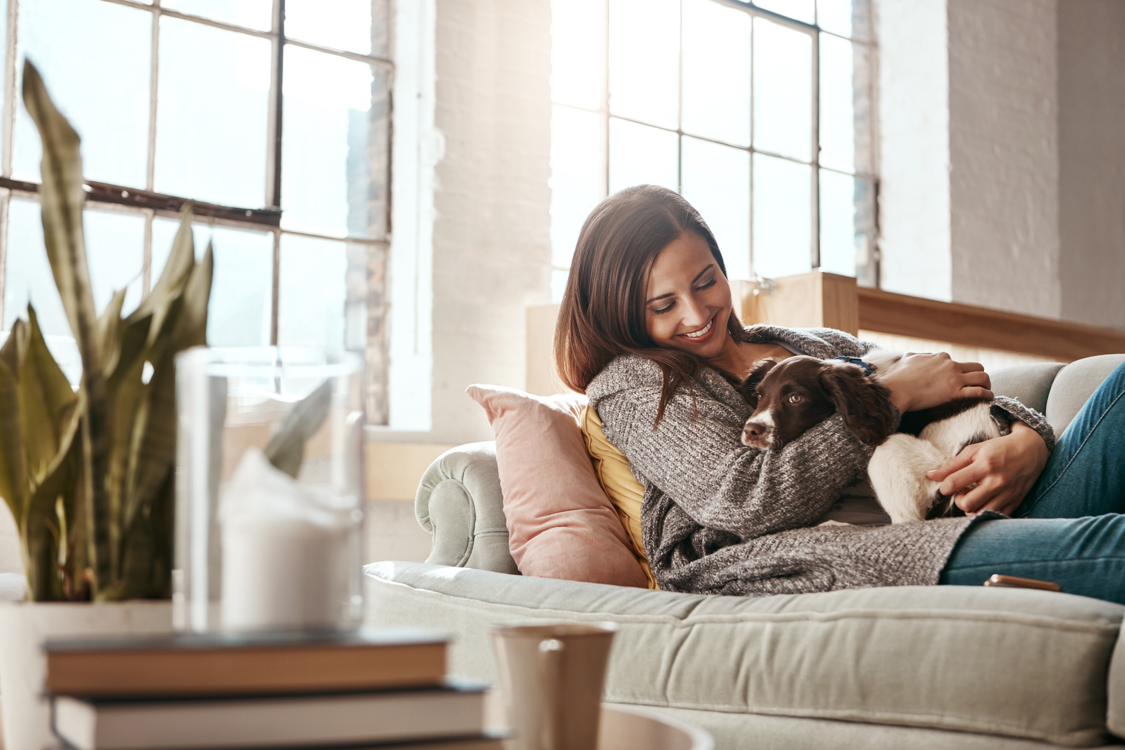
Included more lifestyle photos to bring warmth and relatability
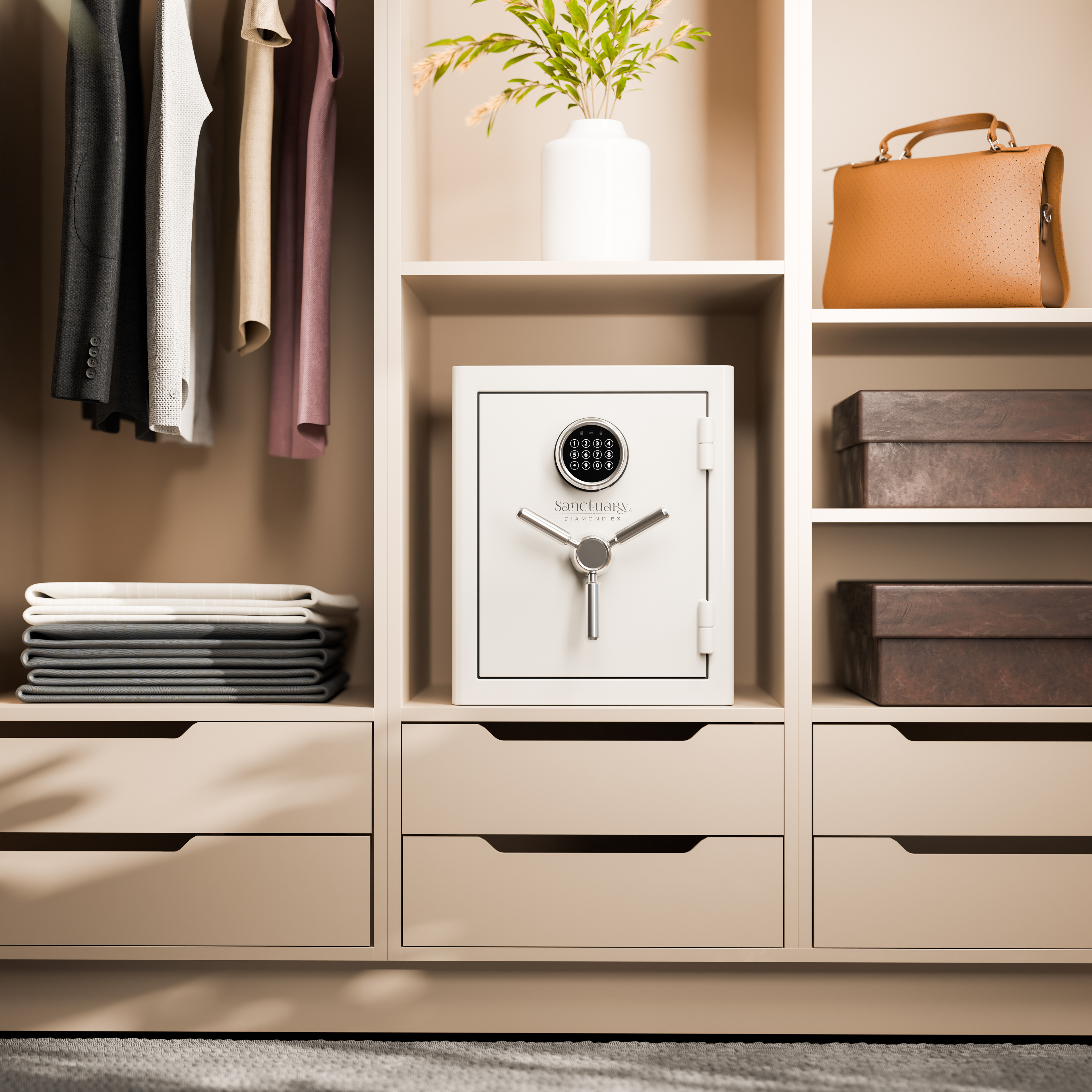
For future manuals using safes we do not ave available to photograph, I art directed the creation of this rendering by working with our 3D rendering artist.
Outcome
As the lead on this project, I was responsible for art direction, template creation, layout design, copy editing, and file production. I collaborated with cross-functional teams to understand product features and translated technical specs into clean, consumer-facing content.
Production Ready: The redesigned manual is now in use across Sanctuary’s product line.Efficient Workflow: The new template system drastically reduced manual creation time and eliminated frequent backend errors.
Team Recognition: The redesign was recognized company-wide. Our CEO even gave it a shoutout during an all-hands meeting, calling it a major step forward for brand cohesion and consumer experience.
Foundation for Growth: This project set the tone for future brand materials, proving that even utility pieces can be moments of brand storytelling.
Challenges & Takeaways
One of the most complex parts of the project was learning the ins and outs of the products themselves. Terms like lock faces, handle types, and fire ratings were completely foreign to me at first. Organizing all of that technical info into a clean, flexible system took time and trial, but it helped me build a more thoughtful and scalable template structure.
I'm proud of how this project turned a dry, often-neglected piece of the product experience into something that now contributes meaningfully to the brand’s identity and consumer satisfaction.
Credits
Date: Completed December 2024
Marketing Director: Stefanie Glassburn
Lead Graphic Designer: Jason Oechslein
3D Rendering Designer: Alibek Raiymbekov
Photographer: Moya Omolulu
COO: Ben Lavalle
Sanctuary Project Manager: Drew Fox
Industrial Designers: Jeremey O’Halloran, Luke Brolsma, Ledong Chen
Agency/company: SA Consumer Products